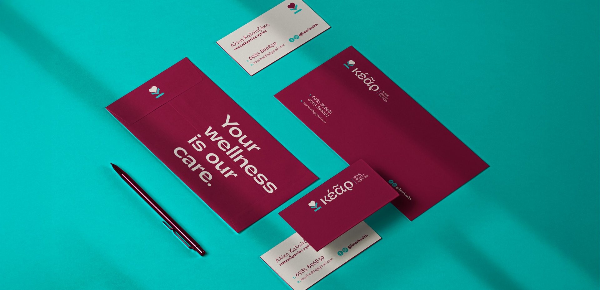
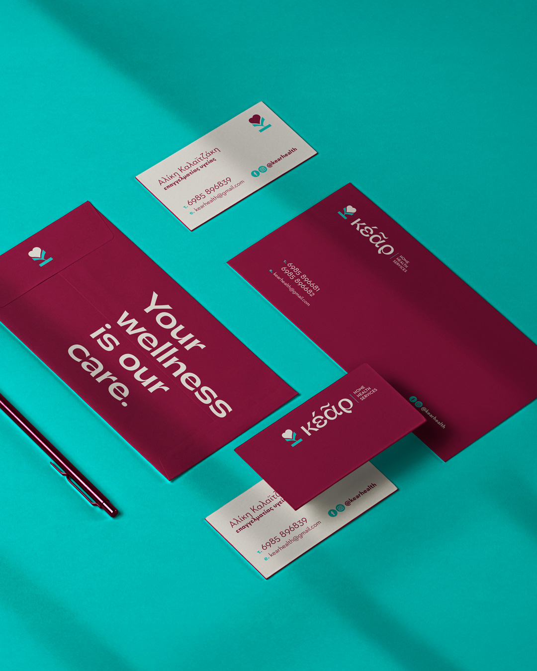
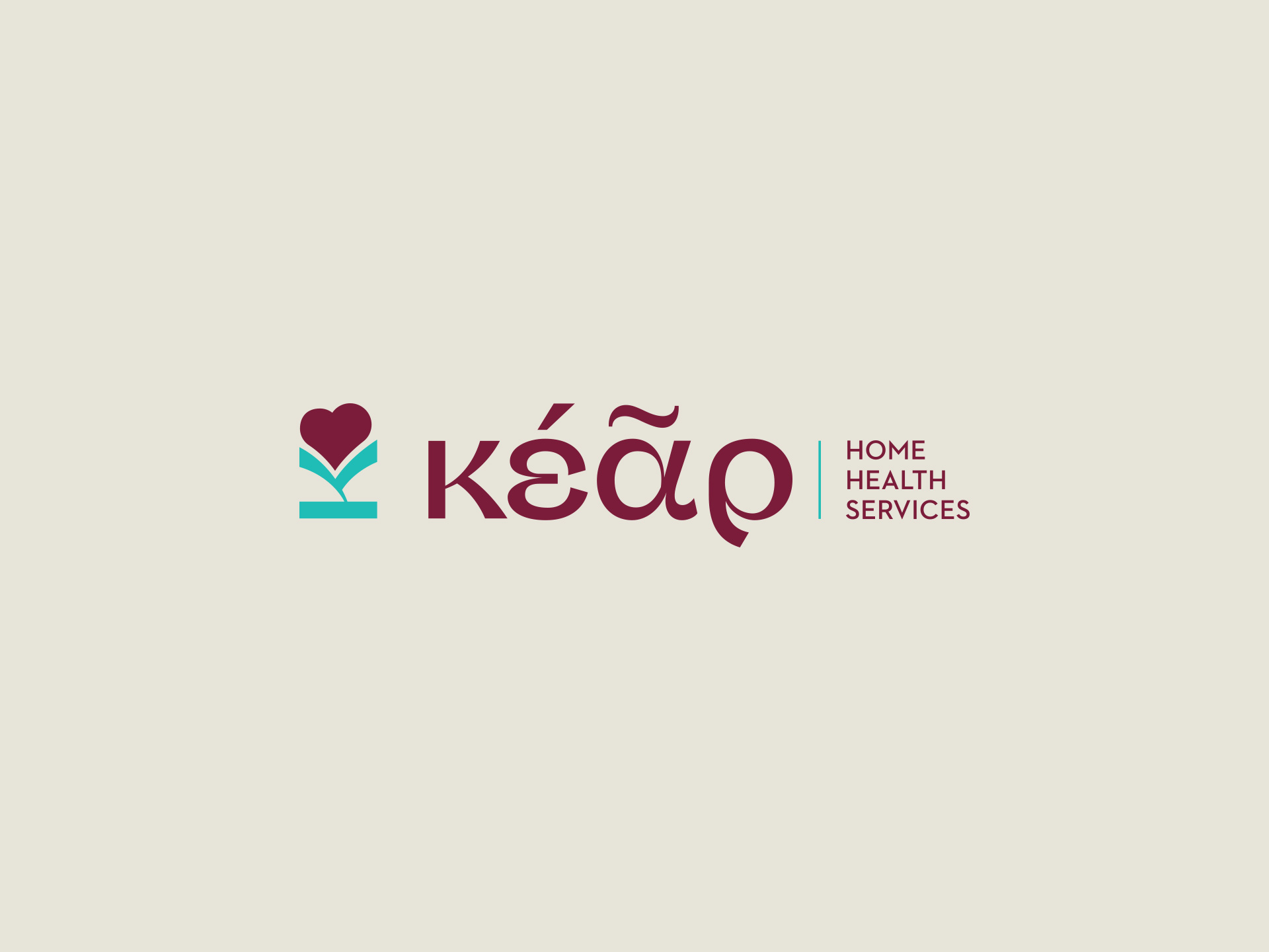
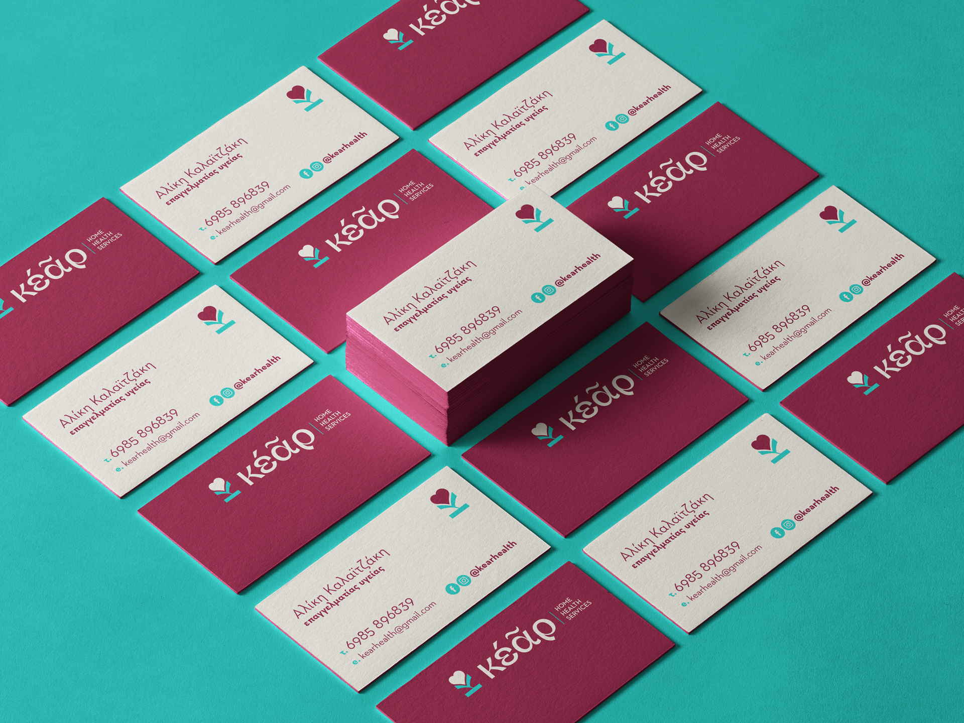
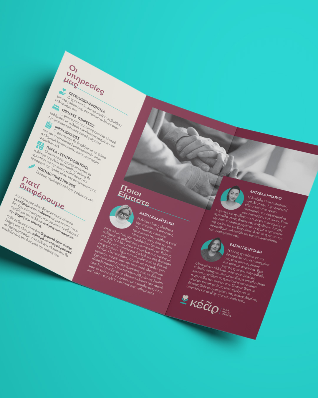
Kear home health services
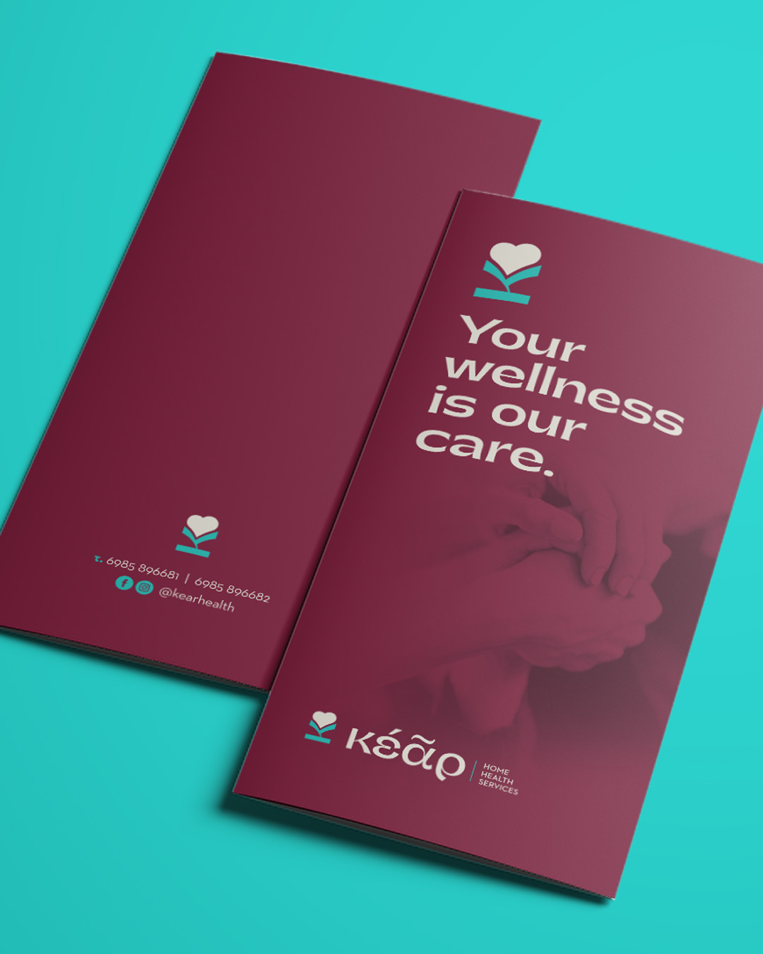
We designed the brand identity for KEAR, a home health service offering support and expert medical attention to elderly and people with disabilities. Inspired by the ancient Greek word kêr (heart) and echoing the sound of care, the name guided the entire concept.
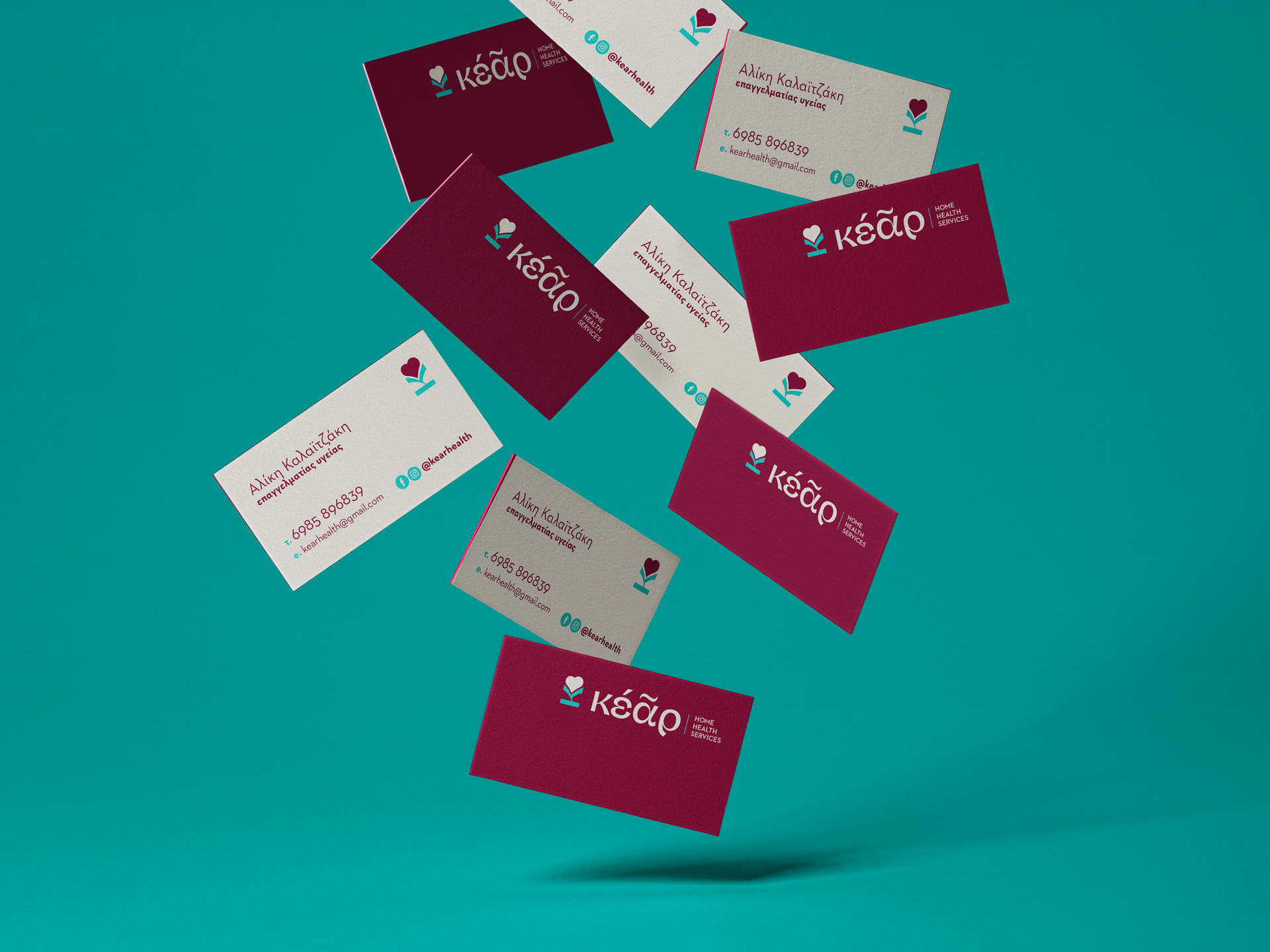
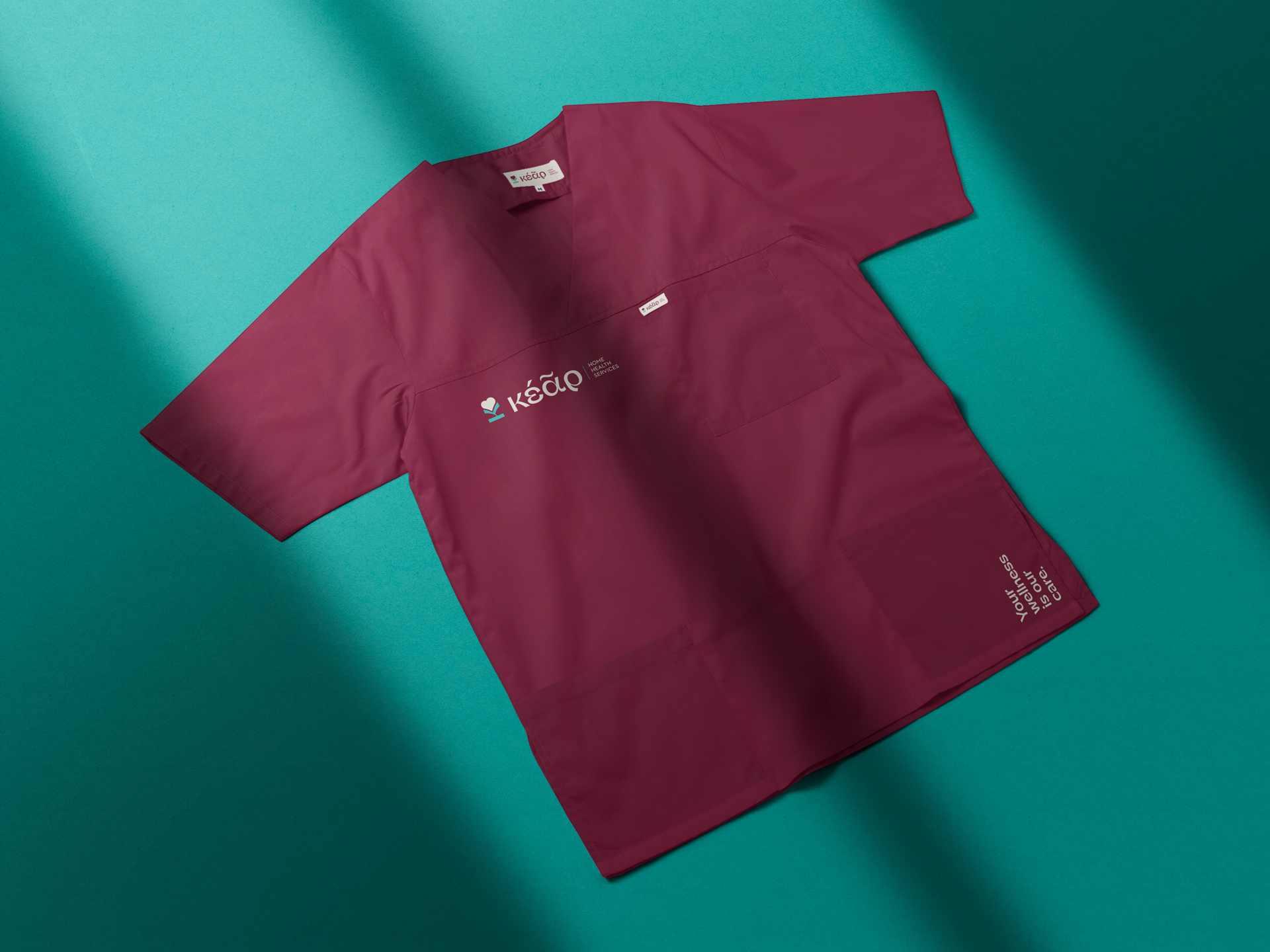
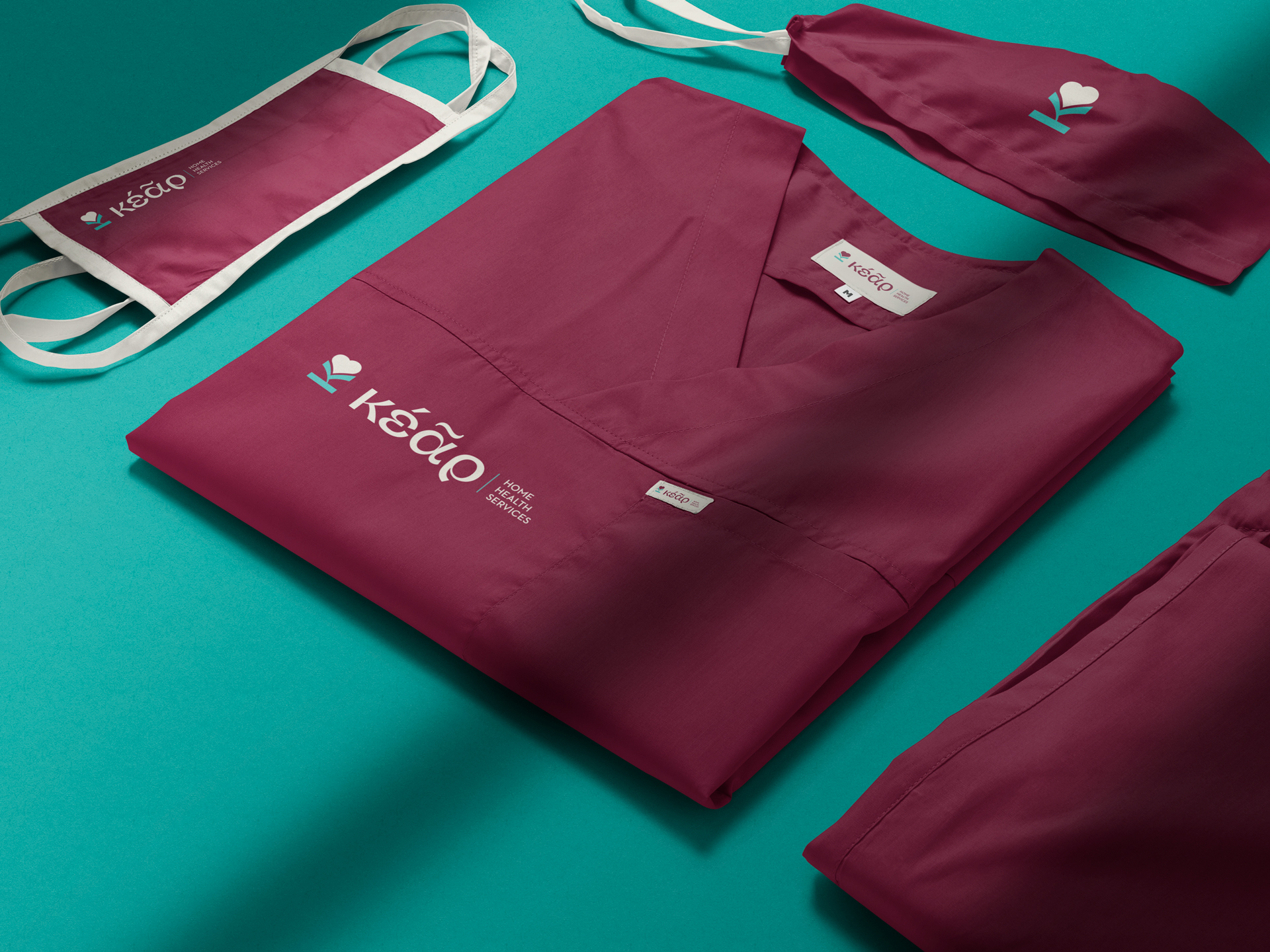
For the logo, we crafted an emblem where a rotated “K” blossoms into a rose, with the heart-shaped petal symbolizing compassion, dignity, and support. An elegant symbol that reflects the company’s mission: to offer reassurance, reliability, human connection and to provide care from the heart.


Did you like it?
Your project could be next. Give us a short brief of what you do and what we could assist you with, and we’ ll get back to you as soon as possible