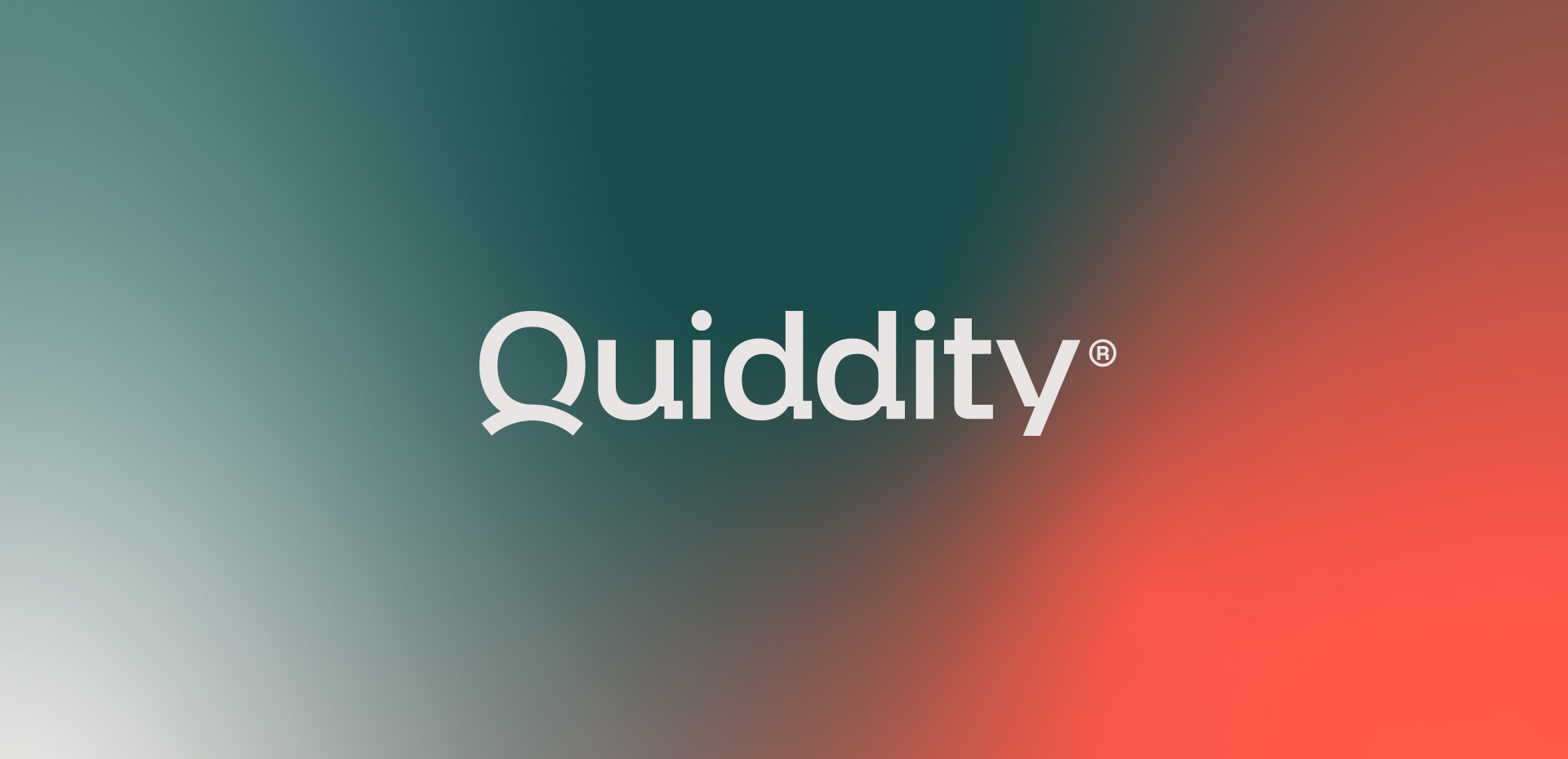

Quiddity
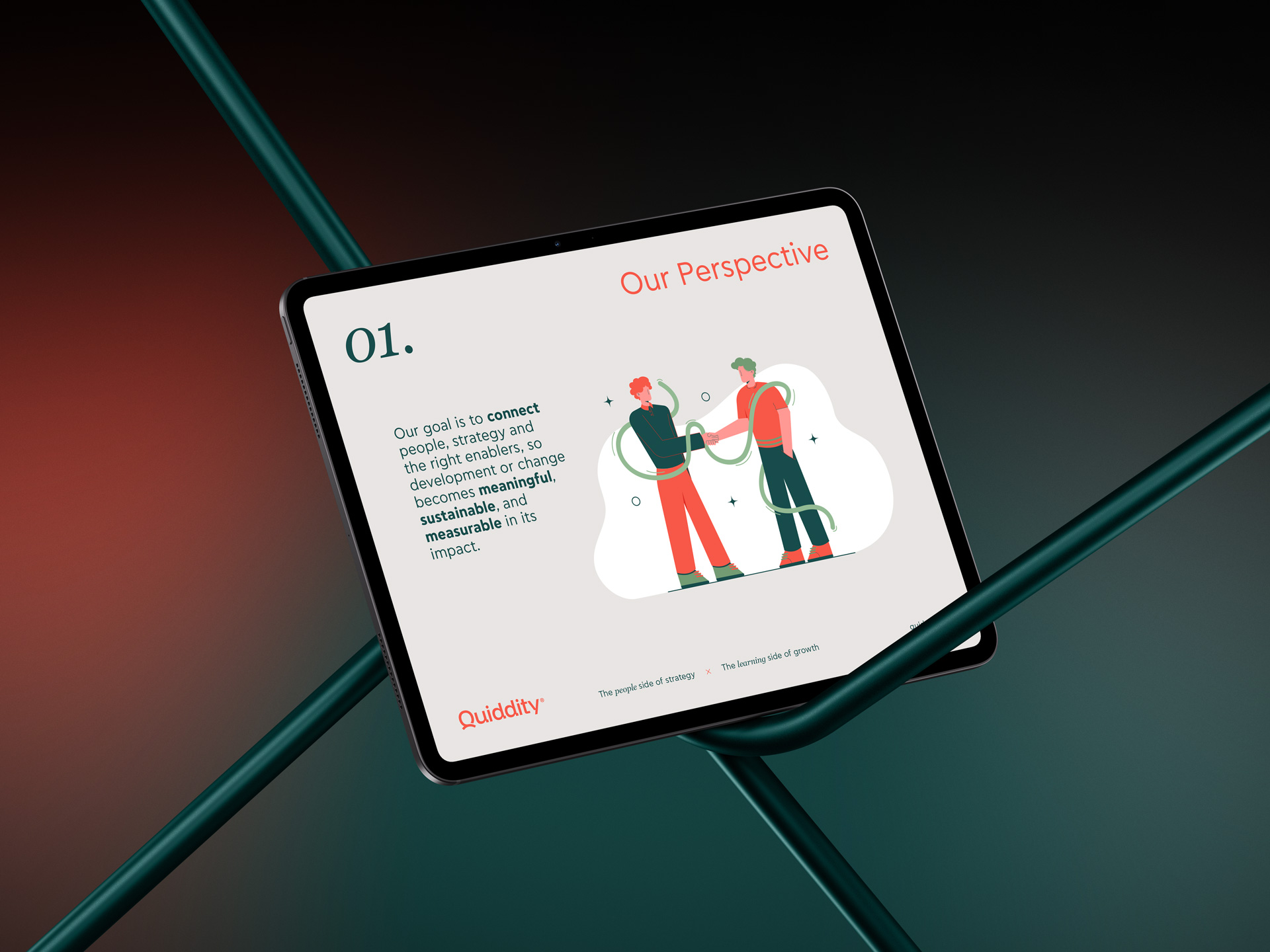
As organizations evolve, growth happens when people learn, connect and turn knowledge into action. That idea became the starting point for designing the brand identity for Quiddity, a company empowering organizations to align their people with purpose, turning corporate learning and strategic thinking into sustainable, measurable growth.
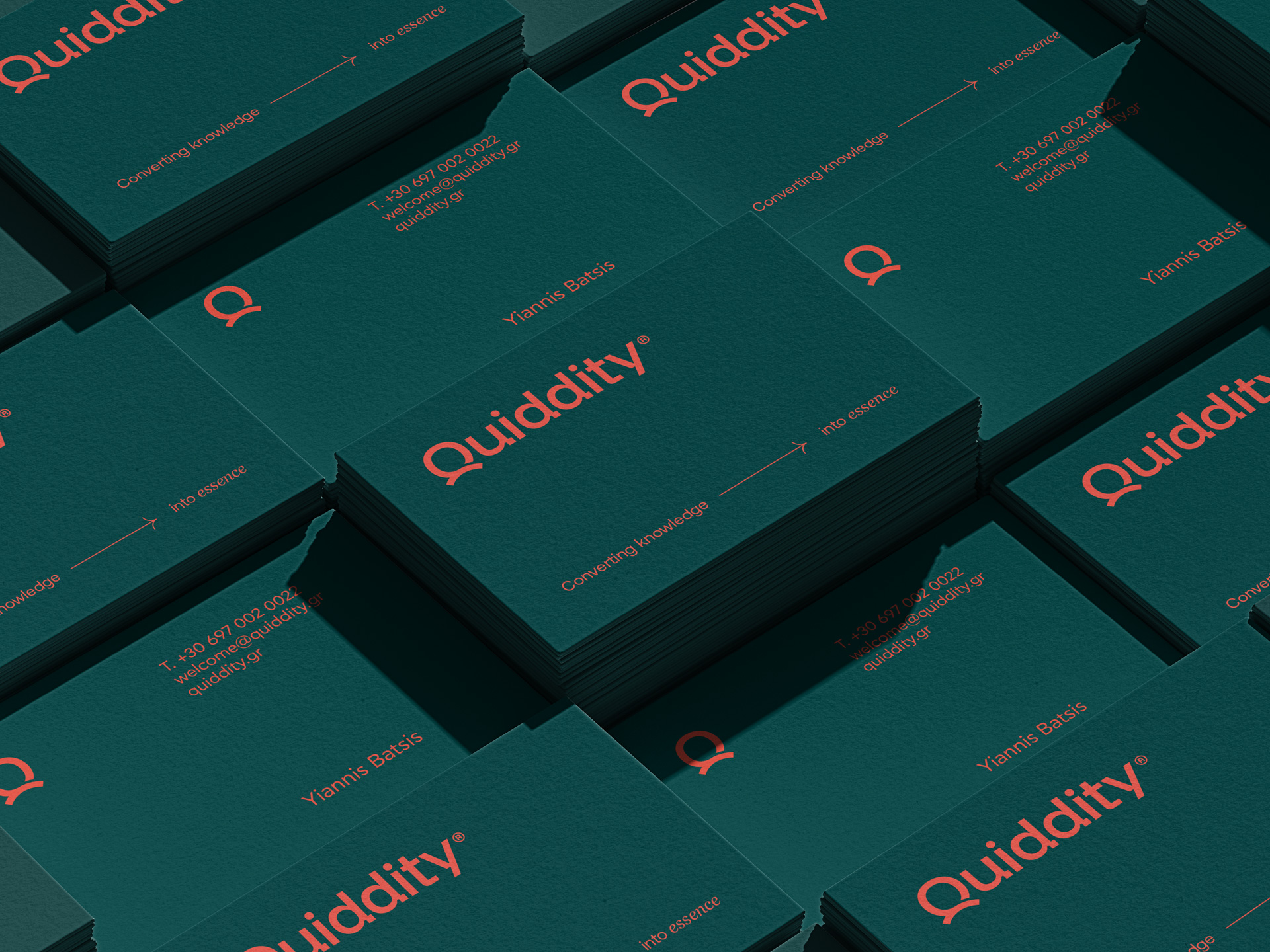
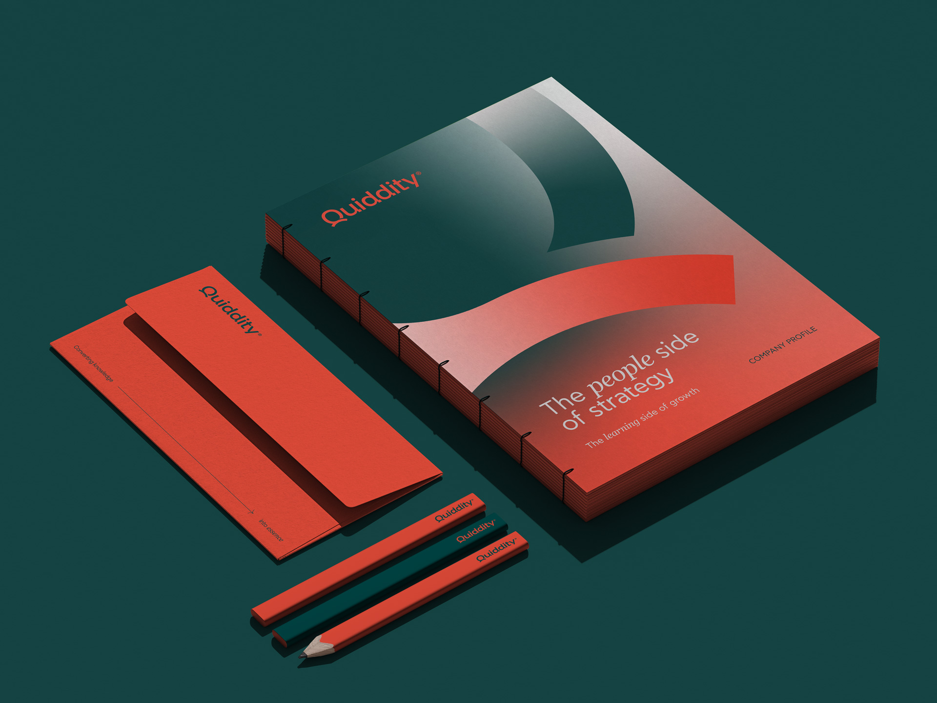
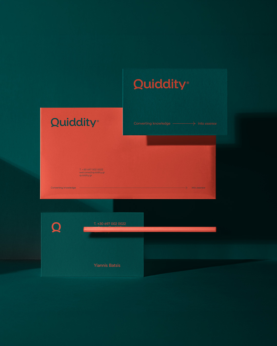
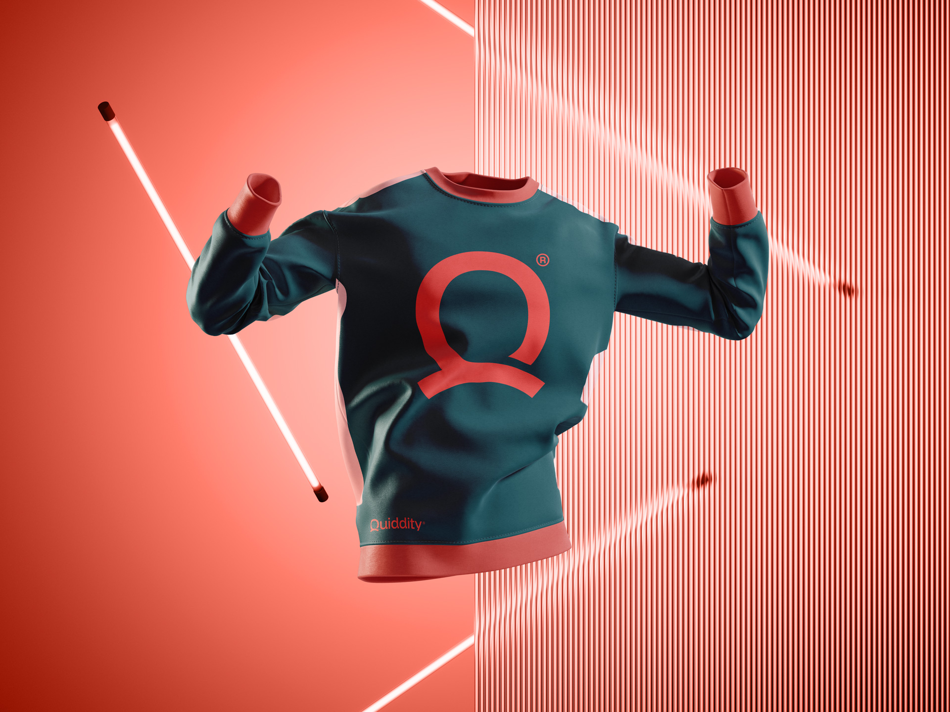
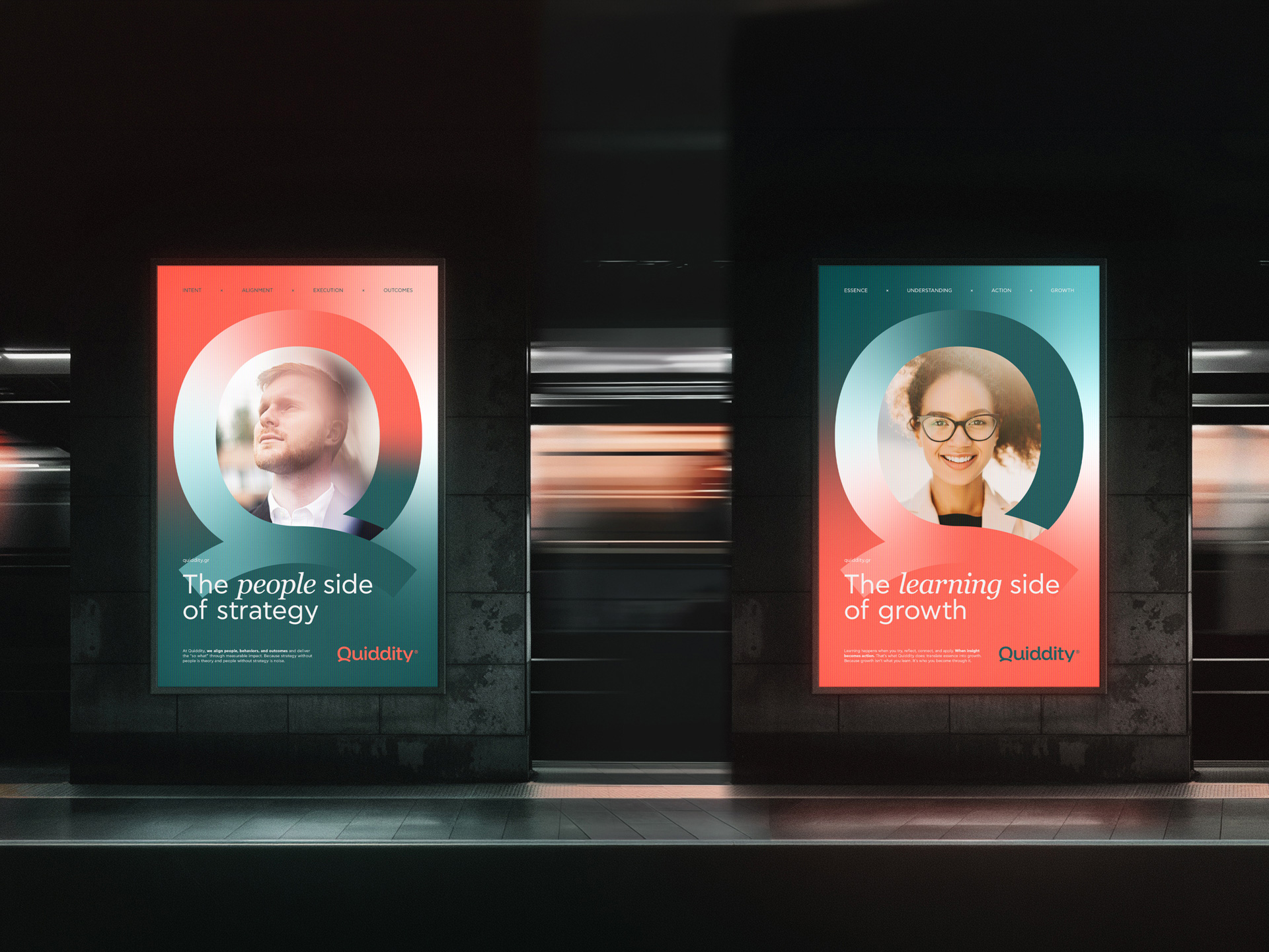
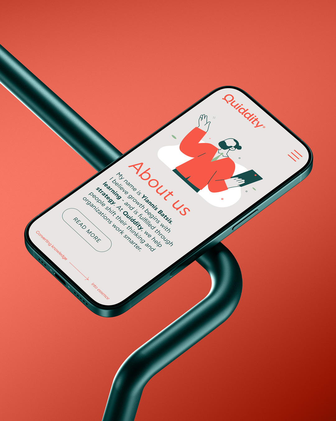
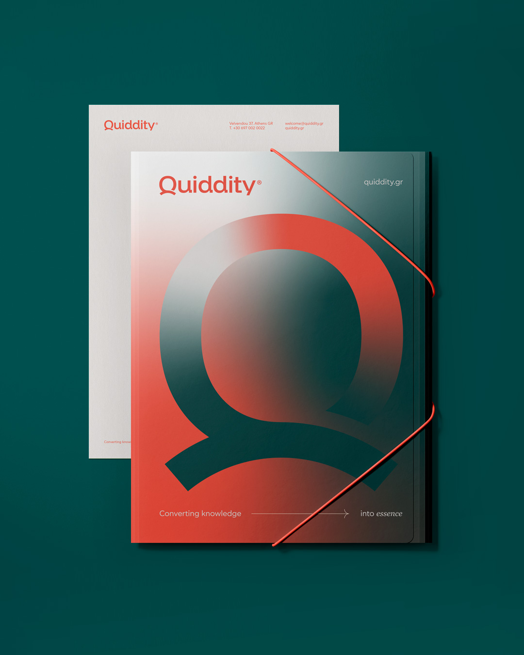
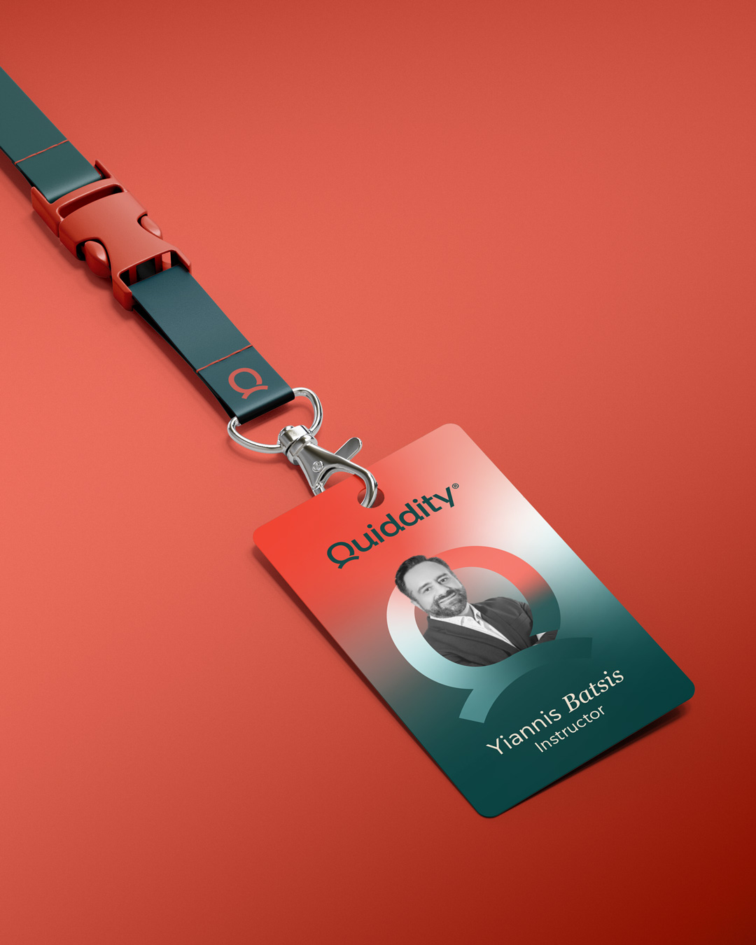
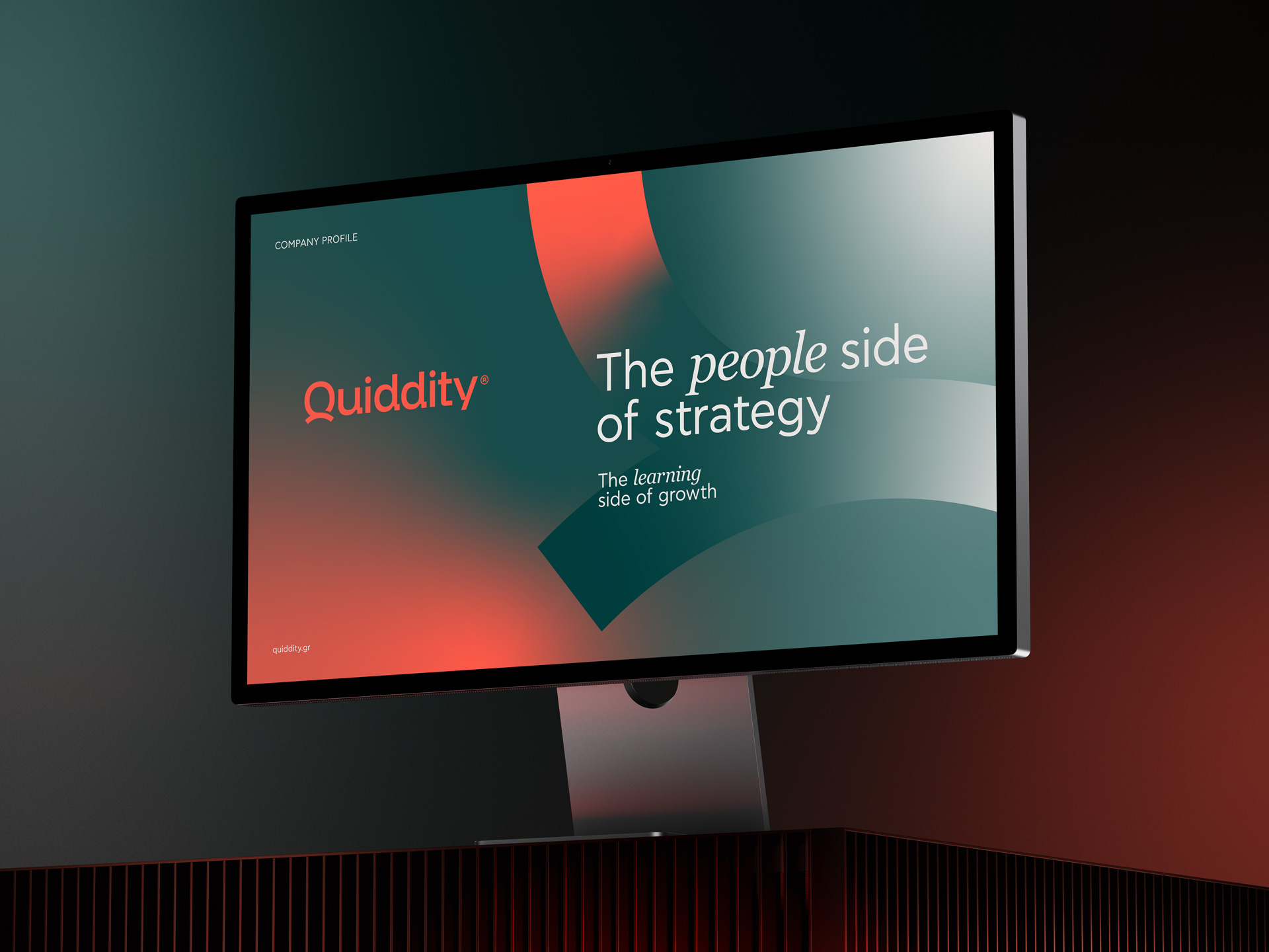
We built a visual identity around the very meaning of its name: “the essential nature that makes something what it is” – and at its core, people are connecting, learning, leading and growing. So, we designed a word mark where the letter ‘Q’ evolves into a human symbol, bringing people at the heart of the brand. A distinctive palette balances growth with energy, creativity and action, crafting an identity that breathes life into the essence of human-driven evolution.
Did you like it?
Your project could be next. Give us a short brief of what you do and what we could assist you with, and we’ ll get back to you as soon as possible